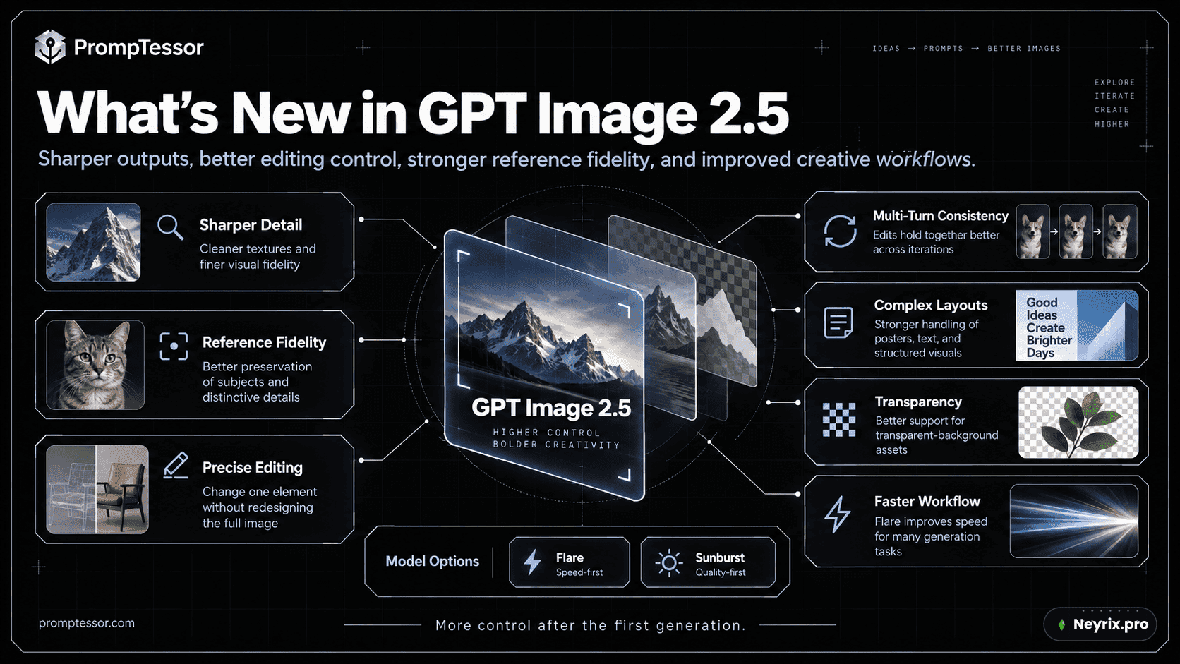
Если ты гуглил что-то вроде «chat gpt image 2.5» и хочешь понять, что это за зверь и как с ним разговаривать — читай дальше. 8 сентября 2026 года OpenAI выпустила ChatGPT Images 2.5 — новую версию генерации картинок внутри чата, а вместе с ней и две модели для разработчиков через API. Разница с предыдущей GPT Image 2 не только в «стало красивее», а в том, что модель наконец умеет менять один элемент картинки, не разваливая всё остальное.
Это меняет то, как нужно писать промпт. Раньше можно было накидать эпитетов и молиться. Теперь качественный запрос должен описывать не только то, каким должен стать результат, но и то, что обязано остаться нетронутым по пути к этому результату. Разбираем архитектуру промпта, 11 рабочих приёмов и кучу примеров — от рекламных баннеров до пиксель-арта. Кстати, всё это можно опробовать прямо на GPT Image 2.5 в Neyrix — официально сервисы OpenAI в России не работают, так что агрегатор тут не роскошь, а единственный удобный способ добраться до модели.
Дата выхода GPT Image 2.5 и что вообще это такое
Раз уж вопрос «gpt image 2.5 release date» реально гуглят — вот точная дата: 8 сентября 2026. В ChatGPT релиз называется ChatGPT Images 2.5, для API вышли две отдельные модели.
[OpenAI introduced **ChatGPT Images 2.5**](https://openai.com/index/introducing-chatgpt-images-2-5/) on September 8, 2026. In ChatGPT, the release brings sharper detail, more natural lighting and texture, improved reference-subject preservation, more precise edits, stronger multi-turn consistency, complex layout handling, transparent-background support, Sketch, creative templates, image comments for targeted edits, and prompt sharing.В ChatGPT это про удобство: можно рисовать грубый скетч прямо в чате, оставлять комментарии на конкретных участках картинки для точечной правки и делиться готовым «рецептом» промпта с другими. Для разработчиков же появились два имени модели в API:
gpt-image-2.5-flare gpt-image-2.5-sunburst
Что изменилось: GPT Image 2.5 против GPT Image 2
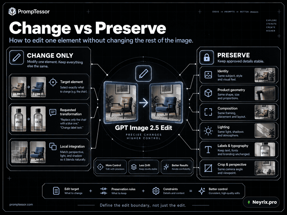
Главное улучшение — не картинка стала красивее сама по себе, а модель стала аккуратнее менять только то, что попросили. Раньше типичная история выглядела так: просишь заменить стул — сдвигается угол камеры. Просишь поменять текст на этикетке — меняется геометрия бутылки. Просишь перевести плакат на другой язык — редизайнится вся композиция.
Many image workflows fail not because the requested edit is impossible, but because the edit destroys something that was already correct. You ask to replace a chair and the camera angle shifts. You ask to change a product label and the bottle geometry changes. You ask to translate a poster and the composition gets redesigned. You ask for a new background and the person's face changes.GPT Image 2.5 борется именно с этим «расползанием» правок. Но промпт всё равно должен явно называть, что нельзя трогать — модель не читает мысли.
WEAK Make the room warmer and replace the chairs. BETTER Replace ONLY the four white dining chairs with walnut dining chairs. Preserve: - camera position and lens feel - room geometry - table position and dimensions - wall color - window light direction - floor reflections - existing shadows - all other furniture and decor Integrate the new chairs with physically plausible contact shadows and matching color temperature. Do not redesign the room.Разница между «слабым» и «сильным» вариантом — не в стиле, а в том, что второй прямо перечисляет зону неизменности. Это и есть главный навык промптинга в 2.5.
Официальная таблица улучшений от разработчиков сервиса выглядит так:
| Area | What Images 2.5 Improves | Prompting Implication |
| --- | --- | --- |
| Visual fidelity | Sharper detail, richer texture, more natural lighting | Use concrete materials, lighting, framing, and texture direction. |
| Reference fidelity | Better preservation of recognizable subjects and distinctive details | State which identity, geometry, product, or character traits must remain fixed. |
| Precision editing | Better at changing only the requested element | Use “change only X” plus an explicit preservation list. |
| Multi-turn consistency | Earlier edits are more likely to survive later edits | Iterate narrowly and restate critical constraints when drift appears. |
| Complex visual instructions | Stronger handling of layouts, real-world information, and transparent backgrounds | Prompt artifacts as structured specs with exact hierarchy and required elements. |
| Speed | Lower latency, especially through Flare | Evaluate model and quality settings independently from prompt wording. |
Что говорят цифры и Reddit
Независимый сравнительный обзор от Pixverse свёл главные отличия в одну таблицу — заметно, что разрешение выросло до 3840 пикселей по стороне, а качество можно крутить вплоть до режимов xhigh и max.
| Area | GPT Image 2 | GPT Image 2.5 update | Why it matters |
| --- | --- | --- | --- |
| Generation speed | Established quality, but slower iteration in many workflows | OpenAI says Flare delivers up to 50% lower latency | More prompt variants and edit passes in the same session |
| API model choice | One `gpt-image-2` route | Flare for speed; Sunburst for precision-focused work | Teams can route drafts and final assets differently |
| Reference fidelity | Supports high-fidelity image inputs | Better preservation of recognizable subjects and distinctive features | More dependable portraits, products, and brand assets |
| Local editing | Can generate and edit images | Better at changing only the requested object, copy, or background | Less rebuilding after a small revision |
| Multi-turn consistency | Details can drift after repeated edits | Earlier changes are more likely to survive later turns | Stronger iterative design and campaign workflows |
| Visual quality | Strong layout and text capabilities | More natural lighting, richer textures, sharper details, and improved style response | More usable photography, concepts, and presentation assets |
| Output control | Standard quality and size controls | Custom resolutions up to a 3,840-pixel edge, plus `xhigh` and `max` quality | 4K-format tests and more precise delivery specs |
| Creative interface | Prompt-led generation and editing | Sketch, templates, comments, and prompt sharing in ChatGPT | More accessible direction for non-technical creators |
А вот и обещанный ответ на «gpt image 2.5 reddit» — реальный отзыв из обсуждения на Hacker News, где разработчики обычно не стесняются в оценках.
In the [Hacker News launch discussion](https://news.ycombinator.com/item?id=49614720), one developer who reported generating about 50,000 images with GPT Image 2 said average latency in their workflow fell from roughly 104 seconds to 35–40 seconds. The same user saw better handling of supplied references in UI concepts and cleaner skin rendering, while still noticing blurry or uneven micro-glyphs. This is a single self-reported workload, not an independent benchmark, but it aligns with OpenAI's latency emphasis.То есть скорость выросла реально, а не только на бумаге в пресс-релизе — но мелкий текст на картинках всё ещё не идеален. Помни об этом, когда закладываешь буферы под ревизию текста.
Flare vs Sunburst: какую модель выбрать
OpenAI дала два инструмента на разные задачи, и путать их — верный способ переплатить или, наоборот, не дожать качество.
| GPT-Image-2.5 Flare | GPT-Image-2.5 Sunburst |
|---|---|
| Маленькая, оптимизированная по скорости модель, дефолт для большинства задач | Базовая модель, приоритет — качество |
| Соцсети, прототипы, визуальный поиск, высокая нагрузка | Рекламные кампании, полированные продуктовые фото, точечные правки с жёстким контролем |
| Оставляй, если качество проходит проверку и задержка ниже | Оставляй, когда её преимущество в качестве действительно нужно |
Логика выбора укладывается в простую схему:
IF GPT IMAGE 2 ALREADY MEETS QUALITY ↓ TEST FLARE FIRST ↓ KEEP PROMPT / REFERENCES / SIZE / QUALITY CONSTANT ↓ COMPARE ACCEPTED-IMAGE QUALITY + LATENCY IF GPT IMAGE 2 FAILS A COMPLEX QUALITY REQUIREMENT ↓ TEST SUNBURST FIRST ↓ ESTABLISH THE REQUIRED QUALITY ↓ THEN TEST FLARE ↓ USE FLARE ONLY IF QUALITY STILL PASSESЕсли уже сравнивал похожие модели раньше — почитай наш разбор GPT Image 2 vs Flux 2, логика выбора «скорость против качества» там та же, только модели другие.
Универсальный каркас промпта для GPT Image 2.5
У генерации с нуля и редактирования разные структуры промпта. Смешивать их — частая причина, почему результат «почти то, но не то».
Для новой картинки
DELIVERABLE What asset are you creating and where will it be used? SUBJECT What is the primary subject? SCENE Where is it, what is happening, and what belongs in the environment? COMPOSITION Framing, camera angle, hierarchy, negative space, placement. VISUAL DIRECTION Lighting, palette, materials, texture, medium, realism level. TEXT Exact copy, number of appearances, location, hierarchy, typography. CONSTRAINTS What should not appear? OUTPUT Aspect ratio / orientation / intended production use.Для правки
EDIT TARGET What exactly should change? PRESERVE What must remain unchanged? REFERENCE ROLES What does each input image contribute? INTEGRATION How should the changed element match existing lighting, geometry, perspective, texture, and shadows? EXCLUSIONS What must not be added or redesigned? OUTPUT What production requirement must still hold after the edit?Компактная версия того же принципа — если нужен быстрый чек-лист перед отправкой запроса:
What visual asset should be created? Where will it be used? Primary subject, visible attributes, pose, product, or object. Environment, action, supporting elements, time, atmosphere. Framing, viewpoint, crop, placement, hierarchy, negative space. Lighting, palette, materials, texture, medium, realism, finish. Exact copy, placement, number of appearances, hierarchy, typography. Image 1 = identity Image 2 = product Image 3 = visual style What changes? What must remain unchanged? What must not appear or drift?Не обязательно использовать каждый блок в каждом промпте — бери только то, что реально нужно конкретной задаче.
11 приёмов, которые реально работают
1. Начинай с актива, а не со стиля
«Кинематографично, премиально, эстетично» — это не описание задачи. Начни с того, каким конкретно артефактом должен стать результат и где он будет использован.
Create a 4:5 paid-social product photograph for a premium sparkling water launch.2. Описывай видимое, а не расплывчатые ощущения
Make it premium and cinematic.Слабо, потому что «премиально» ничего не значит для модели. А вот так — работает:
Photorealistic studio product photography. A single brushed-aluminum bottle on pale limestone, photographed at a slightly low three-quarter angle. Large softbox from camera-left creates a broad controlled highlight. Gentle negative fill on the right preserves shape without crushing shadows. Warm off-white background, muted stone palette, subtle surface texture, no dramatic color grading. The finish should feel like a high-end fragrance campaign photographed for print, not a glossy 3D render.Второй рецепт коротко подтверждает ту же мысль: указывай субъект, действие, кадрирование, масштаб, материал, направление света, палитру и текстуру — а если хочешь фотографию, прямо об этом скажи.
Specify subject, action, framing, relative scale, material, lighting direction, palette, and texture. If you want a photograph, say so directly and describe the camera-level appearance. Lens terms can guide the look, but they do not guarantee a physically exact simulation.3. Управляй композицией явно
Composition: - product occupies the lower-left third - keep the top-right 35% visually quiet for copy - horizon line sits below center - no bright objects behind the empty headline area - maintain enough edge padding for a 4:5 social crop - do not place decorative elements near the safe margin4. Типографика — это требование, а не пожелание

Headline, exact: "Built for the work after the first answer." Render exactly once. Placement: upper-left, aligned to a clean vertical grid. Hierarchy: - headline is the largest text - no subheadline - no decorative microcopy Typography: bold modern sans serif, high contrast against background. No additional words, logos, signatures, or watermarks.Готовый текст фиксируй заранее, а после генерации всегда проверяй орфографию, регистр, переносы строк и отсутствие дублей.
5. Разделяй «что меняется» и «что остаётся»
Change ONLY the bottle's painted body color from warm white to deep cobalt. Preserve: - bottle shape and proportions - cap geometry - printed label copy - label placement and scale - camera angle - product position - background - existing reflections - shadow direction and softness - crop and aspect ratio Update only the reflections and color bounce that would naturally result from the new surface color. Do not redesign the label. Do not add decorative graphics. Do not change the environment.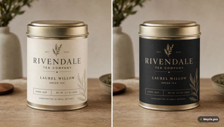
6. Назначай явные роли референсным изображениям
Image 1: primary product identity. Preserve geometry, label, cap shape, materials, and proportions. Image 2: lighting reference only. Use its large soft source, warm back rim, and controlled shadow contrast. Do not copy its subject or background. Image 3: composition reference only. Use its left-weighted placement and negative-space ratio. Do not copy colors, text, or product design.«Используй фото 2 как референс» — слишком расплывчато для серьёзной работы. Скажи прямо, за что отвечает каждый референс: за идентичность, стиль, одежду, палитру, композицию или фон. Похожий принцип мультикомпозиции из нескольких фото мы подробно разбирали в статье про Nano Banana 2 Free.
7. Сохраняй личность, геометрию продукта и брендинг
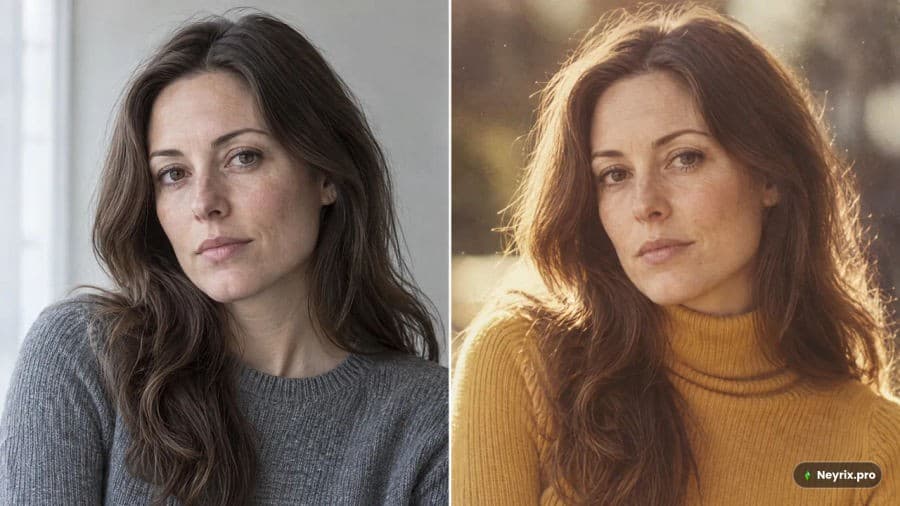
Preserve: - facial structure and proportions - eye shape and spacing - nose shape - lip shape - skin tone - hairstyle and hairline - body proportions - pose - expression Change only the clothing. Do not beautify, age, de-age, stylize, or reinterpret the person's identity.Preserve: - exact bottle silhouette - cap geometry - label dimensions - logo position - printed copy - material finish - proportions - camera perspective The product must remain recognizably the same SKU.8. Итерации — одно изменение за раз
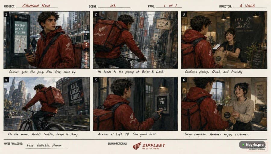
Turn 1: Change only the season from late summer to winter. Preserve layout, product, text, and camera. Turn 2: Replace only the headline with: "Winter, without the weight." Preserve all other design elements. Turn 3: Move the product slightly lower. Do not change its scale, perspective, or lighting. Turn 4: Increase background snowfall slightly. Keep product and typography unchanged.9. Прозрачный фон — прописывай и в промпте, и в настройках
Create a clean e-commerce product cutout from the supplied bottle image. Preserve the exact product geometry, cap, label, printed text, material, and proportions. Remove the entire environment. Output: - one centered product - fully transparent background - clean alpha around edges - no white halo - no checkerboard - no scenery - no artificial floor - no added cast shadow Do not redraw or restyle the product.10. Скетч как ограничение композиции
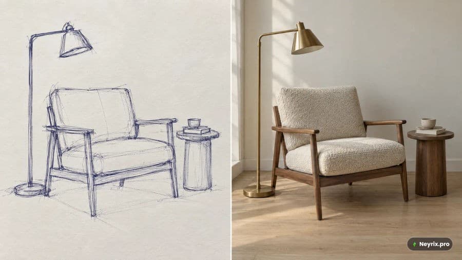
The uploaded sketch defines: - layout - object positions - scale relationships - camera perspective - horizon - major negative-space regions It does NOT define: - materials - final lighting - texture - photorealistic detail Turn the sketch into a photorealistic boutique hotel lobby. Preserve the exact room geometry, camera position, and furniture placement. Materials: warm limestone floor, dark walnut reception desk, brushed brass details, linen seating. Lighting: soft daylight from the left windows with warm practical lights. Do not add new furniture, text, artwork, or architectural elements.11. UI, слайды и диаграммы — как спецификация артефакта
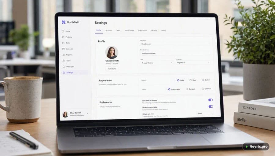
Create a realistic desktop analytics dashboard for a B2B SaaS product. Canvas: 1440 × 1024 desktop application view. Layout: - 240px left navigation - top bar with workspace selector and date range - main area with 12-column grid - KPI row - one primary time-series chart - secondary acquisition table Use real interface hierarchy and spacing. No concept-art decoration. No fake device mockup. No oversized marketing headline. The result should look like a shipped product screenshot.Параметры API — не смешивай их с текстом промпта
Промпт описывает визуальную задачу, а параметры запроса настраивают модель, разрешение и прозрачность. Держи их раздельно и меняй по одному за раз.
| Параметр | Значения |
|---|---|
| model | gpt-image-2.5-flare / gpt-image-2.5-sunburst |
| quality | auto, low, medium, high, xhigh, max |
| size | auto или конкретное поддерживаемое разрешение |
| background | auto, opaque, transparent |
Не считай, что более высокое качество автоматически лучше для любой задачи — тестируй минимальный уровень, который проходит твои критерии приёмки.
Реальные кейсы, где видна разница
Инфографика с подписями, которые можно проверить
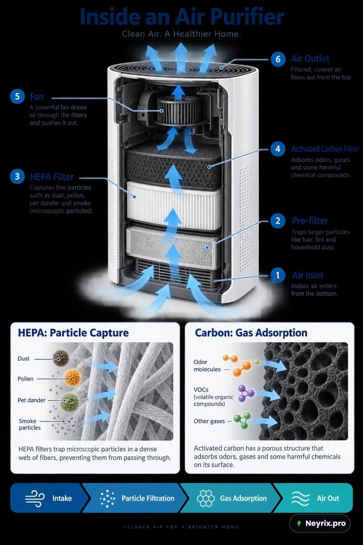
Create a detailed educational infographic explaining how a household air purifier works, designed for an English-speaking consumer audience. Use a vertical 2:3 layout.

Title: “Inside an Air Purifier”

Place a large three-quarter-view cutaway illustration of an unbranded air purifier in the center. Retain part of its white outer casing so viewers can recognize the complete appliance while also seeing the internal filters, fan, and air channels. Use a plausible conceptual design rather than reproducing a specific commercial model.

Number and label these six components:

1. Air Inlet
2. Pre-filter
3. HEPA Filter
4. Activated Carbon Filter
5. Fan
6. Air Outlet

Arrange the labels neatly on both sides of the appliance. Connect each label to the correct component using thin leader lines. Keep labels outside the cutaway so they do not obscure the internal structure.

For this conceptual design, show air entering through the lower section, passing sequentially through the pre-filter, HEPA filter, and activated carbon filter, then moving through an upper fan and exiting through the top. Use continuous blue directional arrows to make the airflow easy to follow. Do not route arrows through solid, sealed components.

Below the main illustration, include two enlarged detail panels. Label the first “HEPA: Particle Capture” and show airborne particles being captured by a fibrous filter. Label the second “Carbon: Gas Adsorption” and show some gas molecules being adsorbed onto porous activated carbon surfaces. Clearly distinguish these mechanisms. Do not suggest that the purifier produces oxygen or removes every pollutant.

At the bottom, add a horizontal process strip with this exact text: “Intake → Particle Filtration → Gas Adsorption → Air Out”

Use the visual style of a professional science magazine: a white background, dark navy headings, restrained blue and teal accents, realistic appliance materials, and crisp diagram annotations. Prioritize readable labels and a clear information hierarchy over dense paragraphs.

All visible text must be in English, using the exact title and labels provided. Do not include Chinese characters, other languages, brand logos, promotional claims, decorative filler, or watermarks.
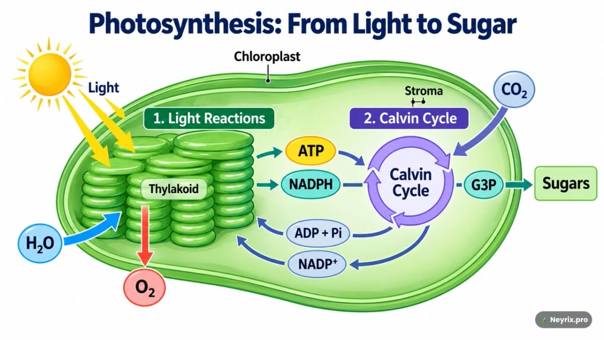
Такой промпт — это спецификация, а не «нарисуй воздухоочиститель». Для инфографик, диаграмм и слайдов не доверяй генерации фактические цифры и связи — проверяй подписи и стрелки после генерации, как в примере с диаграммой фотосинтеза ниже.
Логотип с точным написанием бренда
Тест на восстанавливаемый бренд-эмблему без превращения его в универсальную «чайную» декорацию.
**Our take:** This example tests restraint more than visual complexity. A usable result should preserve the teapot silhouette, botanical negative space, and type hierarchy without turning the emblem into generic tea-house decoration. **Review before publishing:** inspect the exact spelling and ampersand, confirm the background is truly transparent, and check that the logo stays recognizable at the smallest intended display size.Design an original logo for a boutique tea brand named “Willow & Kettle”, intended for an English-speaking audience. The identity should feel calm, welcoming, botanical, and refined, combining the comfort of a traditional tea house with a clean contemporary aesthetic.
Create a centered, vertically stacked composition on a square 1:1 canvas.
Main symbol: Feature a rounded teapot in deep forest green, with a gently curved spout pointing left, an open loop handle on the right, and a domed lid topped with a small round knob. Add a thin warm-gold accent beneath the lid. Integrate a subtle leaf-shaped negative-space curve into the teapot body, giving the silhouette a botanical character without making it overly complex.
Place two stylized golden tea leaves beneath the teapot, one extending toward the lower left and the other toward the lower right. Their curved stems should loosely cradle the base of the teapot. Keep the leaves simple and balanced, not arranged as a decorative wreath.
Typography: Below the emblem, render the brand name exactly as: “Willow & Kettle”
Use an elegant, high-contrast serif typeface with distinctive letterforms, a graceful ampersand, and carefully balanced spacing. Keep the wordmark on one line and make it wider than the teapot emblem.
Beneath the wordmark, render: “TEA HOUSE”
Use smaller, widely spaced sans-serif capitals in warm gold. Place a short, thin gold horizontal line on each side of this subtitle. Each text element must appear only once.
Color and finish: Use only deep forest green and warm golden ochre as solid colors. Create crisp, flat, vector-style artwork with smooth contours and clean negative space. The gold should be a flat color, not a metallic or foil effect.
Leave generous clear space around the complete logo. Use a genuinely transparent background, with no visible checkerboard pattern.
Show one standalone logo only. Do not include packaging, signage mockups, bread, wheat stalks, bakery imagery, gradients, shadows, 3D effects, distressed textures, additional slogans, or watermarks.
The only visible text must be “Willow & Kettle” and “TEA HOUSE”. Do not include Chinese characters or any other text.Пиксель-арт персонаж и лист анимации
Create a single white-background pixel-art character and animation sheet.

TOP SECTION — upper 30%: One large, full-body static sprite of an original Stardew Valley–inspired farm adventurer, facing right. Short copper hair, freckles, cream shirt, green overalls, mustard scarf, brown boots and teal satchel. Cheerful expression, relaxed standing pose. Warm, charming 16-bit farming-RPG pixel art.

BOTTOM SECTION — lower 70%: Exactly 16 smaller animation sprites arranged in a strict 4×4 grid, read left to right, top to bottom: Idle → arm swing → shallow crouch → deep crouch → push-off → takeoff → rising → higher rise → jump apex → descending → lower descent → feet reaching down → landing → compressed landing → settle → idle.

All 16 sprites must depict the exact same character, costume, proportions and pixel scale. Keep the horizontal body pivot fixed within every cell. Use a consistent ground baseline, with a smooth vertical jump arc above it. Do not recenter airborne poses vertically. Frame 16 closely matches frame 1.

Keep every complete sprite, satchel and dust particle inside the central 68% of its cell, with generous pure-white gutters. Tiny dust particles only at takeoff and landing. Separate the top portrait from the animation grid with a wide white gap.

Pure opaque white background. Hard pixel edges, limited palette, no blur. No grid lines, labels, numbers, text, watermark, scenery, cropped limbs or overlapping cells.
Этот промпт хорошо показывает, зачем нужна секция COMPOSITION из общего каркаса: без явных процентов зоны и фиксации пивота сетка анимации почти всегда «плывёт» между кадрами.
Что ещё умеет модель — небольшая галерея форматов
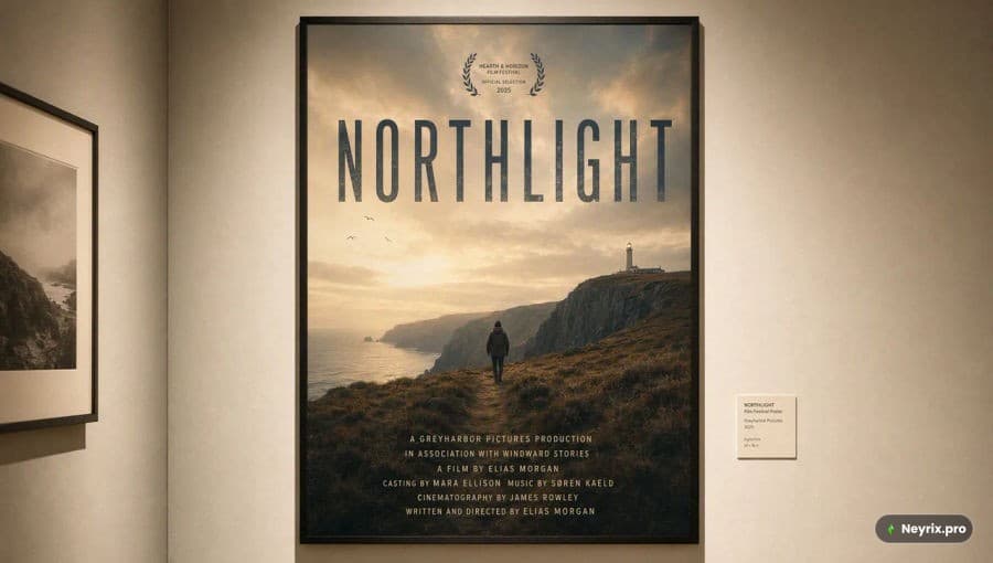
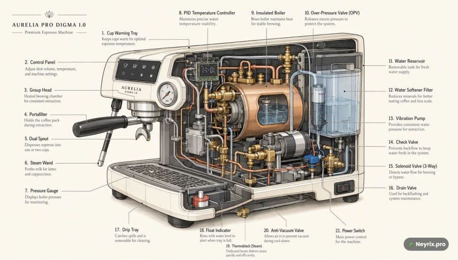
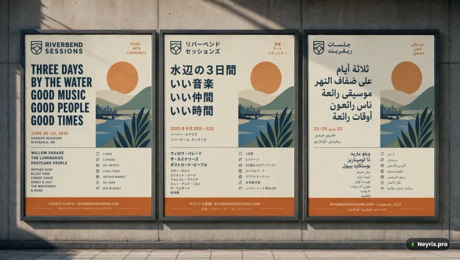
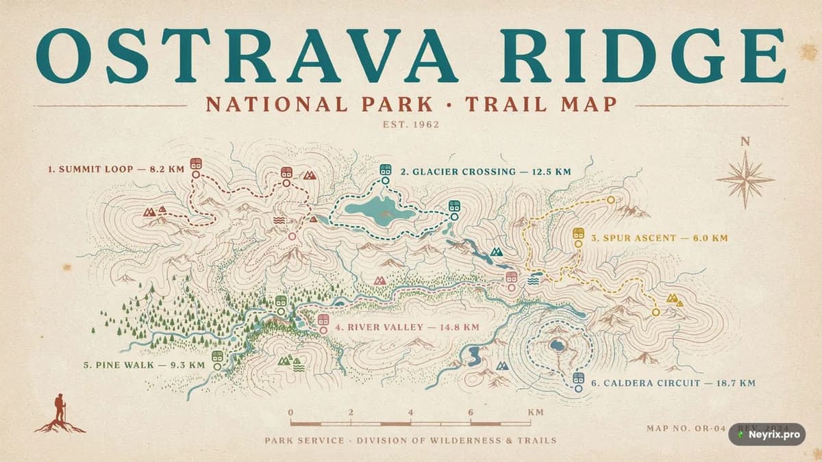
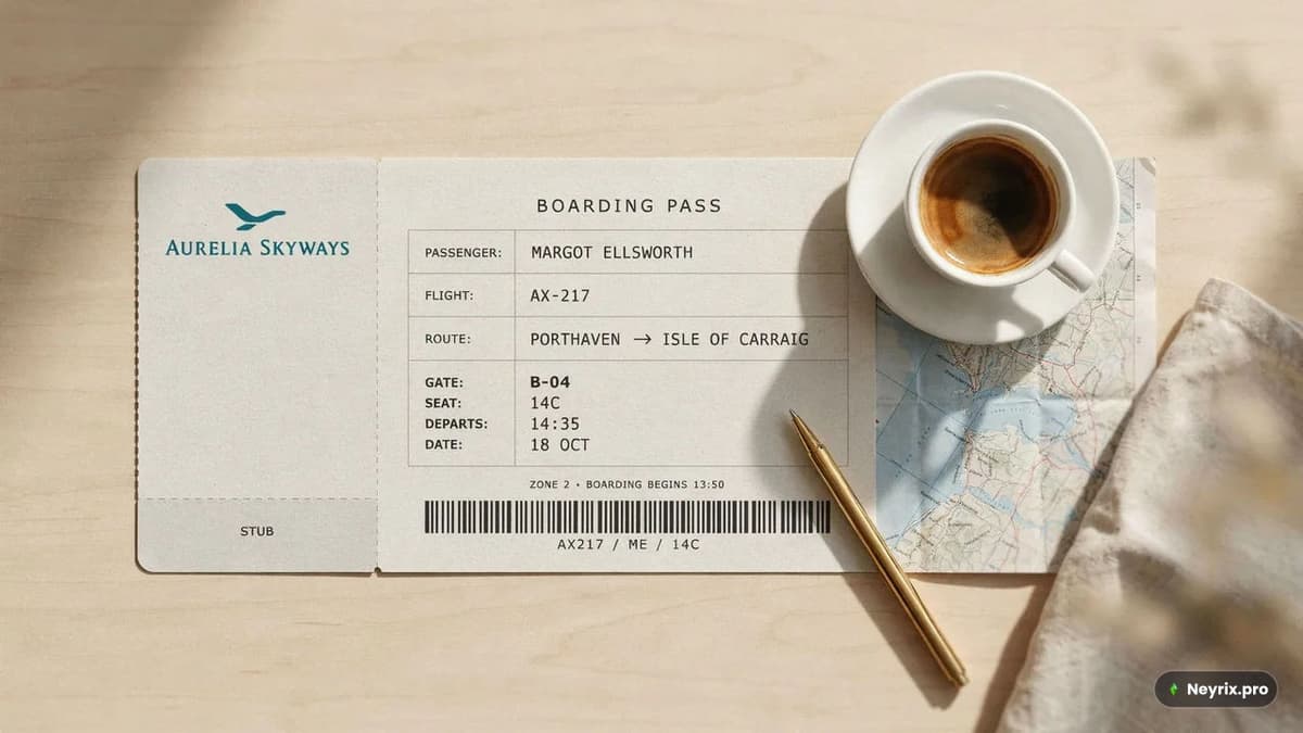
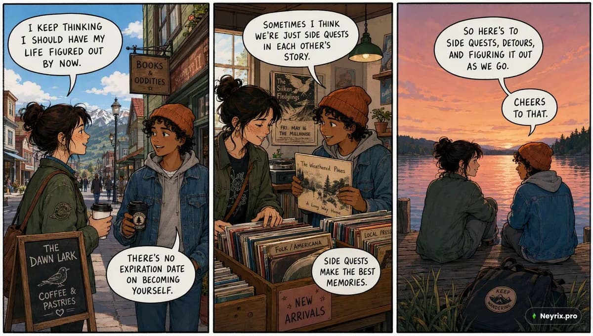
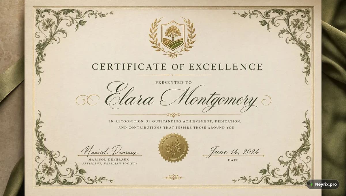
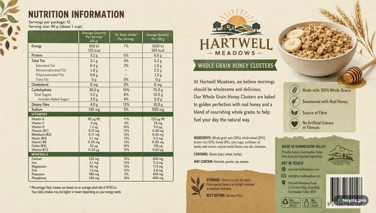
GPT Image 2.5 неплохо держит форму в форматах, где важна и картинка, и точный текст одновременно — от постеров до посадочных талонов.
Как оценивать промпты, а не только картинки
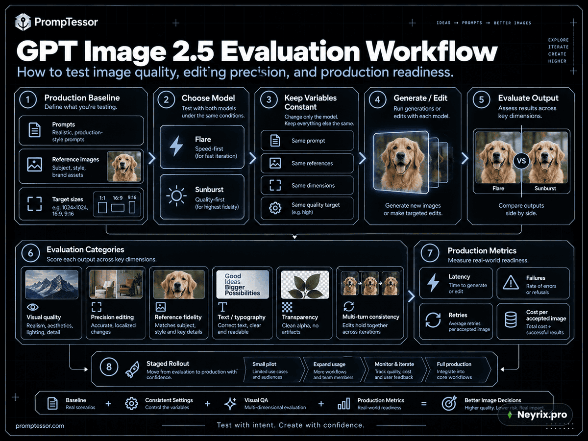
Оценивай не одну картинку, а весь рабочий процесс: генерацию, правки, сохранение деталей, текст, прозрачность, задержку, повторы и стоимость на одно принятое изображение. Собери сложные тестовые кейсы — точный текст, лица, геометрия продукта, несколько референсов, прозрачные ассеты, локальные и многоходовые правки — и держи промпт, референсы, размер и качество неизменными при первом сравнении моделей.
Шпаргалка: главное о промптинге GPT Image 2.5
* Start with the asset you actually need: product photo, poster, UI preview, slide, diagram, transparent cutout, campaign image, or edit.
* Describe subject, composition, visible treatment, and constraints instead of relying on style adjectives alone.
* For editing, separate **what changes** from **what stays unchanged**.
* For reference-led workflows, assign each input image a specific role such as subject, style, clothing, product, or background.
* Quote exact text and state how many times it should appear.
* For text, diagrams, slides, and data-heavy visuals, verify generated labels and relationships after generation.
* Make one meaningful change per iteration when consistency matters.
* Restate critical preservation rules when later edits begin to drift.
* If something must remain pixel-identical, use deterministic compositing rather than relying on prompting alone.
* Use Flare when speed is the priority or when an existing GPT Image 2 workflow already meets quality requirements and you want to test lower latency.
* Use Sunburst when demanding quality, precision-editing, product, brand, or campaign requirements are not reliably met by Flare.
* Keep model, quality, size, background, and output-format settings separate from the prose prompt.
* Do not assume higher `quality` always improves every prompt. Test the lowest setting that meets your acceptance criteria.
* For transparent assets, request transparency in both the prompt and API settings, then inspect the alpha channel.
* For sketch-to-image workflows, treat the sketch as layout intent and explicitly preserve its geometry and perspective.
* For UI, slides, charts, and diagrams, prompt like an artifact specification rather than concept art.
* Evaluate the full sequence of edits, not only individual images, when multi-turn consistency is part of the product experience.
Где попробовать GPT Image 2.5
Официально сервисы OpenAI в России не работают, поэтому самый простой путь — агрегатор вроде Neyrix, где GPT Image 2.5 уже доступен без танцев с VPN и картами. Можешь взять любой промпт из этого гайда, вставить как есть и сразу увидеть, справляется ли модель с сохранением деталей на твоей задаче. А если параллельно интересно сравнить с другими генераторами картинок — у нас в блоге есть разбор GPT Image 2 против Flux 2.
Частые вопросы
OpenAI представила ChatGPT Images 2.5 и модели GPT Image 2.5 Flare и Sunburst 8 сентября 2026 года.
Flare — быстрая модель с задержкой до 50% ниже, подходит для большинства задач и черновиков. Sunburst — более качественная модель для сложных правок, брендинга и точного сохранения деталей.
Официально сервисы OpenAI в РФ не работают. Проще всего попробовать модель через агрегаторы типа Neyrix, где она доступна напрямую.
Разработчики отмечают заметное ускорение генерации (в одном случае — с ~104 до 35–40 секунд) и более чистую отрисовку кожи и референсов, но иногда мелкий текст на картинке остаётся смазанным.
model (flare/sunburst), quality (auto, low, medium, high, xhigh, max), size (auto или конкретное разрешение) и background (auto, opaque, transparent).
ChatGPT Images 2.5 — это функция внутри чата со скетчами, шаблонами и комментариями для точечных правок. API-модели flare и sunburst предназначены для разработчиков и подключаются напрямую по коду.